Case Study — What I Learned by Offering Illustrations to War and Conflict Magazines
Offering images that include negative elements, such as recognizable guns and war vehicles, is surprisingly hard even when you offer them to war and conflict magazines. The outcome is that images (which I call feel-bad images) get easily rejected, and not only due to their artistic quality but also because of too negative elements. In this essay, I ponder why this might be the case. I also show what kind of images I have offered. That helps the reader to see, what I really talk about. If the reader happens to be an illustrator as well, the images might help her or him to avoid the same mistakes I have made.
As said, negative elements might be problematic even for the magazines that study topics like war. To a contributor, it might come as a surprise. It seems that though it's totally OK to make for example a war movie (and even as pure entertainment!), it's not OK to offer illustrations about it, at least if they are negative images. That might sound strange, especially because we all see war movies, war zone photos, and other negative visual materials daily.
However, we usually see them, for example war zone images, in the right context, such as in the news articles. A context like that immediately tells us that these images don't exist, because their creator is enchanted by violence. They exist, since, unfortunately, the world needs visual material about such subjects too.
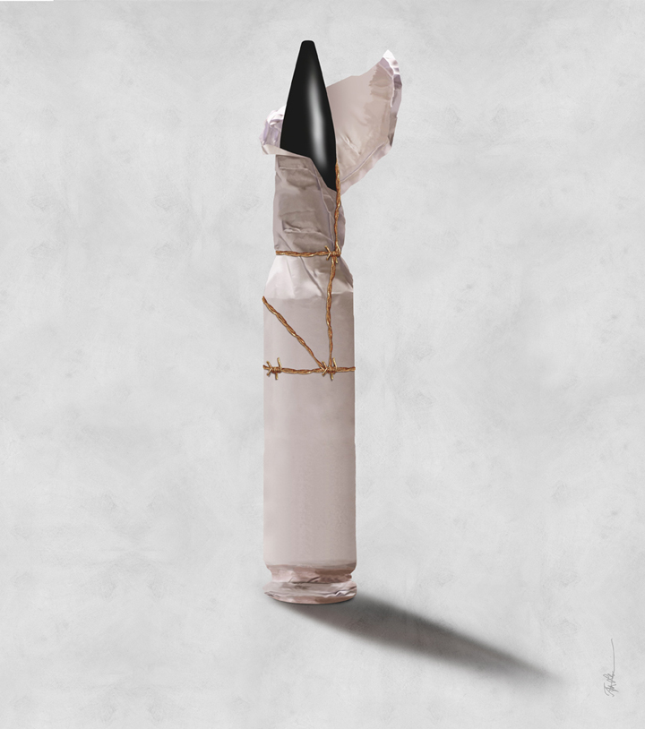
When the illustrations or artworks are sent to the magazines, there's no supportive context—yet. The image had to stand on its own. The trouble can then be that the receiver interprets that the illustration, for example a portrait of a bullet, celebrates its subject. Why else would the artist have put all the time and effort into that image? I had offered an image of a bullet to magazines (next page). Do I admire the gun industry? No. I have just made a random image that could some day illustrate an article or a short story. From another point of view, I made this particular image, since I once found a keychain with a bullet-looking charm. My core education is sculpture. Maybe because of it I was fascinated by the charm's slim, shiny surface and sculptural form. It reminded me of a bronze version of Bird in Space (1927; next page), a known sculpture
by Romanian artist Constantin Brâncuşi.
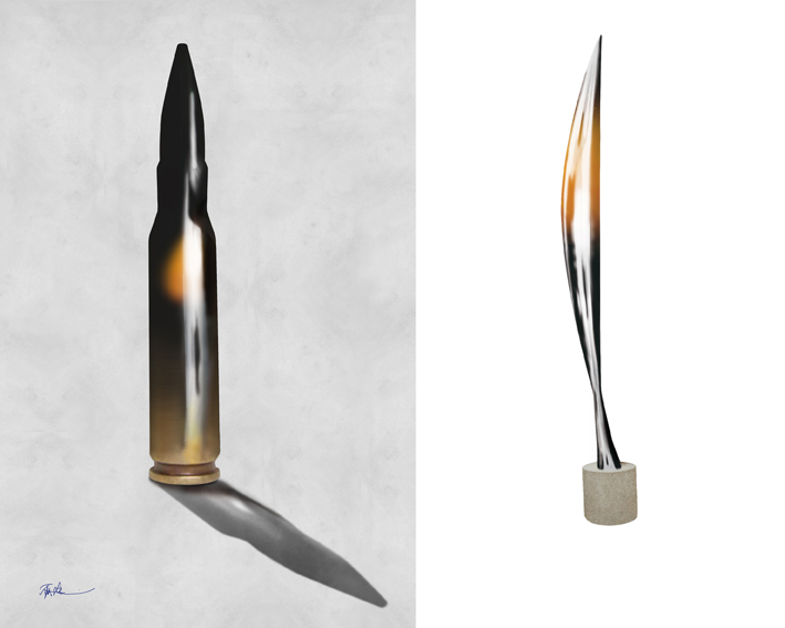
        As seen from the explanation, my bullet has nothing to do with the gun industry or some unpleasant political views. It represents things that are so far from the world of violence that, when offering the image to the conflict magazines, my explanation for its existence would be irrelevant. However, without any explanations, a bullet image does enable myriad interpretations. I have the feeling that for an editor of a magazine, it's even easier to assume that the maker might have some unpleasant attitudes. At least, it’s safer to reject these kinds of images, just in case. No magazine, not even a conflict magazine, wants to accidentally send a message that the magazine itself celebrates such values. So, the image ends up being a victim of its own subject. However, in the right context, such as a short story about the afternoon the war began or an article about conspiracy among certain bullet manufacturers, the bullet illustration would make total sense. In those kinds of contexts, the image would support all the human values we in the art world want to support.
        Even though the magazines tell their contributors that they need material about certain themes, perhaps it's not wise to take those requests literally. Even though the magazine is about war, for example a portrait of the soldier might be something too aggressive (next page). At the same time, the poor humanist illustrator is just thrilled, since she or he has managed to do such technically demanding illustration. After wasting so much time doing it, an illustrator is blind to see anything but that. Still the truth is that it would have been wiser to make for example a stylized image about multiple hands in various, hopeful colors.

Perhaps it's a mistake to ever use negative elements in illustrations. I might be wrong. It might be that my works have been rejected due to their lack of quality. I don't even know if their color profile works in the USA. The images might be so dark that the viewer cannot even see what they are about. However, if I have interpreted the responses correctly, that has not been the case.
I sometimes wonder if the problem is ”hierarchical”. A merited, world-famous movie director has the collectively approved license to handle big themes and use violent, controversial, or political elements to do so. An anonymous contributor doesn't have the same license. In his or her "position,” it's maybe not appropriate to handle certain topics. The issue would then be the same as with a Victorian lady, who was allowed to write poems about flowers and children, but not analytical essays about world politics and economics. Something like that might (or might not) affect on the background. I mean that the contributor really needs a license, position, or street credibility to be able to handle certain subjects without causing embarrassment or confusion. A life-long career as a newspaper illustrator of world-political issues allows big topics, but what if you don’t have that impressive CV?

        Perhaps the biggest problem of the feel-bad images is that they never look good. Or? However, we do know that images of explosions (for example) can be visually impressive. We also know that, as said, professional photos of war zones, equipment, etc., are acceptable and needed. But, as also said, we see those images in the right contexts, so there's no need to wonder why on earth someone wants to photograph something like that (a machine gun, for example). The context, such as a news article or an established museum environment, also implicitly says that the artist really has the license. When sending material to a magazine editor, an anonymous contributor is a totally different animal.

        The material sent can even end up in the editor's personal email. In a private environment like that, even a faintly controversial content might impact like an uninvited di*kpic, if the brutal term is allowed. Of course, I don't know if that is the case. However, I know that due to viruses and email scams alone, we all are wired to be cautious of any material we receive from unknown sources. That may (or may not) make negative artworks appear even more negative than they are. I don't know, but as a contributor to such negative content, I would love to know.
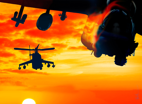
Maybe an image of confronting air vehicles looks like a celebration of fighting? However, the same image could have a totally different tone, if the editor, who finds the image too military, had ordered it from an illustrator. The arrow would then be the opposite, and the editor would know right from the start why the image exists: not because the maker is a war maniac, but because such an illustration is needed for an article about an unfortunate air event. I don't know, but, once again, I would love to know! All in all, it's safe to assume that it's a different thing to order a feel-bad image than to receive a bunch of them, especially if they come without explanations. I assume that the explanations are seldom made, at least very thorough ones. The contributor might wonder if the explanations are even red. He or she might also think that it's not a good idea to waste editors' time with unnecessary textual ramblings. After all, the images are (sort of) self-explanatory, since they are about the themes that the magazine is about. But what if the case is that, despite the magazine's themes, the magazine actually doesn't want images that are explicitly conflict-driven? What if the magazine, at least subconsciously, prefers something that softens the impact of those complicated themes? Maybe this is the case, but magazines just don' articulate it aloud, since making extra explanations is stressful for everybody, not just for the contributors. Besides, there are so many contributors that at least some percentage of them understands the dilemma anyway. I don't know, but that’s how I feel, not only because of the rejections but because of the images that seem to get accepted.
        Images easily create the impression that they are “pro” their subjects instead of being against them. That reminds me of Altti Kuusamo, a Finnish art theorist. He has famously said that an image can never say “no." I would argue that this is not always the case. We do know images that say no, for example, to war. We can, of course, ask if it is only due to the context and general contracts that help us to do the right reading. For example, we “know” that the peace sign is against war, but do we know it only because we are taught to interpret the sign so? The peace sign consists of abstract elements. The viewer can manage to see the combination of those elements as a missile. However, without prior knowledge, the sign’s problem is actually the same as the bullet’s. The missile looks like a “pro missile” sign as easily as it looks the opposite! Can any sign say no to weapons without prior education about the sign's actual meaning? Maybe an image really can't say no. That is something worth studying.

        Images’ ability to say no is weaker than the ability of texts. Images are easily misunderstood for other reasons, too. That being the case, it's easy to understand why it is safer for a magazine not to approve images that speak the language of war and other uncomfortable issues too clearly. Even so, we do have tropes that are allowed to include uncomfortable or even disturbing elements. One trope is a howling head, a kind of suffering madman (or woman) face with bleeding eyes, a horrible expression, and perhaps a mushed brain. That kind of subject is acceptable, even if it includes, say, an ax thrown into the cortex or whatever extra spices the artist wants to use this time. We have a contract that suggests that such an image expresses great emotional pain. At the same time, a picture of a slick, shiny bullet is not OK, since it's not one of the common tropes. Without pre-knowledge, we don't know what the bullet "means.” That, at least, is how I feel. Once again, I might be totally wrong.
        One problem is that images are such an open medium. Even from a distance, you can see in milliseconds what the image is about. Text, the miscellaneous group of abstractions, stays somewhat closed until you start to read. Reading often happens intimately alone, allowing the text to include even the most controversial material. That is presumably the reason why books can include more inappropriate material than magazines. For various other reasons, the magazines are more “open” than books. That difference causes issues not only for the visual art contributors but for the text contributors as well. The risk is that they offer too raw material just because they have not (yet) realized that even though the movies and books are allowed to contain chainsaw massacres, that is not a proper material to most magazines. Anyway, compared to any image, text is a closed medium, so it's possible to read even the most controversial book in a public place. It would be much more difficult to watch even semi-secretly an image with similar content. On the bus, the person sitting behind an image watcher sees immediately the same. For that reason alone, an image should always behave better than its textual counterpart.
        Maybe a war illustration should always show the positive instead of the negative? I already mentioned the hand bouquet of hope. That might be a solution, though if a contributor offers a peace dove for example, it should be a very fresh interpretation of such an overused subject.

Showing people that raise their hands toward a brighter future has the same problem. Those kinds of images are also easily condemned to eternal damnation of religious kitsch. Or are they? Interestingly, it depends almost entirely on the artist’s artistic style. Anyway, there are a lot of other reasons why artists are advised not to use obvious elements. We are also taught to avoid preaching to the choir. Moreover, we are taught that ambivalence is good. However, maybe that is not the case in the realm of war and conflict magazines?

The appropriate way to illustrate war and conflicts is somewhere between the bullet and the dove. Exactly where, I have not figured out. Maybe the best war illustration is a peaceful landscape which is just named after a known battle? Possibly the solution lies in the background story of the artist? If that is the case, then, once again, the image needs the support of the text.
As an illustrator, I know that the interaction of the image and the text creates the final whole. I also know that any image says ”no” (or ”yes”, for that matter) when it’s linked to the right text. If an illustration tries to say everything by itself, it can be too "full" when it is connected with a text. The text, after all, is the one that really says. However, as said, when the image is offered to a magazine, it has no textual support. It must pass that bottleneck all by itself to get published. That is its main task, so perhaps it must be as full as possible just to avoid rejection? After all, not all the artworks in the magazines are meant to illustrate texts anyway. Very often, they seem to be presented as their own mini-gallery exhibitions. That practice stresses the importance of the message in the images themselves.
Are my images celebrating war & violence? I don't want them to do that. I want them just to be images that can be used in multiple contexts.
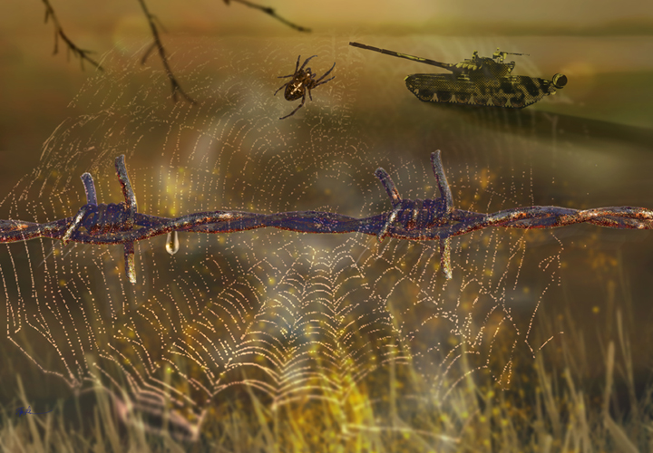
Some images might be too political, even though they don't look like that. For example, there's an illustration of a frozen fence.

        Nowadays, the subject is familiar to the neighboring countries of Russia. Russia does not only have a war in Ukraine. It also uses hybrid war means against its neighbors. Countries, such as Poland, are forced to build fences to get protected. Russia uses, for example, third-world refugees as its hybrid war weapons. When people are used, there's no morally easy or stylish way to solve these situations. For me, the growing amount of fences on the borders of Europe are monuments to these problems.
        I sometimes ponder if this kind of an image raises uncomfortable feelings in the USA, not because of the topic itself, but because it might also remind the viewer of the Trumpist fence policy on the US-Mexico border. Maybe a fence is not OK for that reason? As a foreigner, I don’t know.
        Should we have illustrations about complicated subjects? In theory, everyone can and most probably will say that absolutely; we need them even more than images about easy topics. However, theory is not the same as practice. As far as I see, the problem is that images can't say no. Even if it is not an issue later, it's a problem when the contributor offers images. They can't sell themselves, since they can't explain themselves. Even when the images are thoroughly explained, they still enable misunderstandings, since complicated things are made of misunderstandings in the first place.
        After making images that include weapons, fences, and such, I naturally see that yes, we need images that consist of them. As an audience member, I'm not sure. Do I really want to see illustrations that make me feel uncomfortable? Maybe once in a while, if I cannot avoid escaping them. But what about the literary magazines? There’s at least one reason why we should also
see feel-bad illustrations in them. If all the negative images are censored, or we see them only in certain contexts, that might have some impacts. For that reason alone, we should be exposed to visual negativity. Because literary magazines stubbornly refuse to use AI content, some day they might be the last resort, where we know for sure that we see real reality, at least in the sense of real texts and art made by real humans. In that case, the images should not only include positive elements but negative too. Otherwise, the whole is not, well, whole.
        If these images once again get rejected, I totally understand. For me, making them was a study about communication and the possibilities (and impossibilities) of the images' saying power. It's always wise to step out of one's comfort zone. Doing so and getting rejected taught me a lot about the limits. It's just not nice to bump into them. Wasn’t it the official truth that limits do not exist? The opposite finding makes us uneasy or even desperate, if the limits happen to lie between countries and are iced with NATO wire. However, finding limits in harmless cases like rejection of feel-bad images, can make the bumper wiser and more adolescent, and I am totally satisfied with that end result. Yet, some negative part of me still asks, is the only way to illustrate wars and international conflicts really something like this?

.
Tytti Heikkinen is a Finnish writer and visual artist/illustrator. She has participated in art exhibitions in Finland and Denmark. In the USA, her latest illustrations are forthcoming in Lumina Journal Vol. 20 and Miracle Monocle. Her most recent poetry chapbook, “The World Undressed,” was published by After Hours in the USA in 2023.
